One minute
Density Plot
- Here are some simple way to create density plot that I found useful in visulizing data generated from STORM lipid raft study.
# libraries
import matplotlib.pyplot as plt
import numpy as np
import scipy.stats
# create data
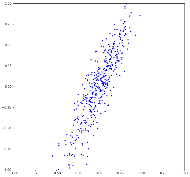
x = np.random.normal(loc= 0, scale = 0.2, size=400)
y = x * 2 + np.random.normal(loc= 0, scale = 0.2, size=400)
plt.figure(figsize=(10,10))
plt.scatter(x, y, c = 'b', marker = '.')
plt.xlim(-1, 1)
plt.ylim(-1, 1)
plt.show()
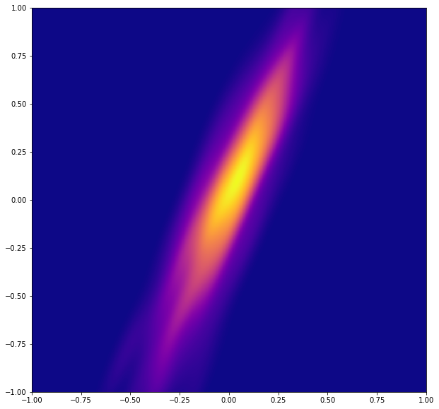
- Evaluate a gaussian kde on a regular grid of nbins x nbins over data extents
nbins=1000
k = scipy.stats.gaussian_kde([x,y])
xi, yi = np.mgrid[-1:1:nbins*1j, -1:1:nbins*1j]
print(np.vstack([xi.flatten(), yi.flatten()]))
xi1 = xi.flatten()
yi1 = yi.flatten()

zi = k(np.vstack([xi1, yi1]))
print(zi)
print(end-start)
[[-1.       -1.       -1.       ...  1.        1.        1.      ]
 [-1.       -0.997998 -0.995996 ...  0.995996  0.997998  1.      ]]
[5.62096536e-32 4.30122671e-32 3.28898734e-32 ... 1.80071967e-38
 2.25257889e-38 2.81593802e-38]
10.173474073410034
# Make the plot
plt.figure(figsize=(10,10))
plt.xlim(-1, 1)
plt.ylim(-1, 1)
plt.pcolormesh(xi, yi, zi.reshape(xi.shape), cmap=plt.cm.plasma)
plt.show()
space = 1000

xi = np.linspace(-1, 1, space+1)
yi = np.linspace(-1, 1, space+1)
Xi, Yi = np.meshgrid(xi, yi)
k = scipy.stats.gaussian_kde([x,y])
Zi = k(np.vstack([Xi.flatten(), Yi.flatten()]))
print(Zi)

plt.figure(figsize=(10,10))
plt.xlim(-1, 1)
plt.ylim(-1, 1)
plt.pcolormesh(Xi, Yi, Zi.reshape(Xi.shape), cmap=plt.cm.plasma)
plt.show()
[5.62096536e-32 1.15379874e-31 2.35952085e-31 ... 1.20896089e-37
 5.84542861e-38 2.81593802e-38]

import seaborn as sns
plot = sns.kdeplot(x, y, shade=True)
plot.figure(figsize=(10,10))
plot.xlim(-1, 1)
plot.ylim(-1, 1)
plot.show()
comments powered by Disqus